Painting

Laughing Tortoise Sign: Part 3

We used Modern Masters Metallics for the Laughing Tortoise Beer sign’s green base colours. The tan colours were General Paint — a (now defunct) 100% acrylic house paint. As usual, everything was double coated before we started the glazing process.

The first glaze was a very light brown. We applied it over the tortoise and around the edges of the scroll. As we brushed it on, we followed with a soft towel and dabbed it off to blend it into the base colour. The glaze remained full strength in the cracks and low areas and on the edges of the scroll.

We make our glazes using 50% clear base paint (without any added pigment) and 50% of normal (tinted) paint.

The next glaze was a dark, dirty blue we call “blue jeans.” We applied it over the green areas of the sign and carefully towelled it off. Once we had finished going over everything once, we went back and second coated the ridges around the letters. This will make the painted letters jump off of the final sign.

A green glaze was next on the list and suddenly the turtle became part of the sign!

Then it was time for the last glaze — a custom blend of dark brown, metallic cherry and a teeny bit of black. We call it plum crazy.

And finally, two coats of gold finished off the lettering (and the sign).

See you next week!
McIltrot Sign - Part 2

The McIltrot sign features a small bird sculpture. My father used sculpting epoxy to form the bird before applying the feathers one at a time.

With the sculpting finished it was time to paint.

We regularly get inquiries regarding our painting process. As a result, it is one of the things we spend a fair amount of time on in our workshops.

Our method uses water based acrylic paint. Once upon a time, we used a brand of paint called General Paint and we currently use Sherwin Williams. Whatever brand you use, we recommend using one of its higher quality lines. We generally use semi-gloss, satin, or low-luster finish. High gloss tends to give a plastic use, and flat paint isn’t quite as nice to work with.

We often use Coastal Enterprises water based ‘marshmallow’ primer to add additional texture to our signs. It is a high build, sand-able primer — we apply it with a brush but we do not sand it — brush marks are our friend! It is important to place the primed work under fan for at least three hours immediately before applying your first coat of paint — this draws out the moisture. This is vital if you want the paint to last!

Once the primer has cured we put on two coats of base colour, drying well between coats. Our base coats cover everything.

Then it is finally time to start laying on a series of glazes to enhance the texture we’ve created.

We mix our glazes ourselves using a simple formula. First we buy the clear base (some brands refer to it as ‘ultradeep base’) but without any colourant added. It looks milky white in the can but drys clear (or nearly clear).

The folks at the paint store will look at you funny when you ask for it — after all, why would you want un-coloured paint?

Our basic glaze recipe is to mix a ratio of 50% clear base with 50% paint of the colour of your choice. This will look coloured in the can but will dry to semi-transparent glaze.

We generally apply a series of two to four glazes. The first glaze is very lightly coloured, just a few shades off of the base colour. The lightest color glaze is brushed on liberally then gently wiped off with a towel. With each coat of glaze we will wipe more and more off, leaving the colours underneath show through.

Dad used some of that same glaze to add colour to the bird's beak. Then the sign is put back under the fan to harden up.

The next colour of glaze is a little darker — in this case a reddish brown. It was flowed on and then wiped off with a towel. Dad took a little more off this time, allowing the colours underneath to show through.

After this, Dad added colour to the bird and the worm. Then the sign goes back under the shop fan once more.

Once the sign has had a chance to harden up, Dad brushed a final dark glaze over the entire piece (including the bird and worm). He left a little more glaze around the lettering to help it read.

Typically we raise our lettering at least a 1/8". This makes it easy to paint the tops by dragging the brush along the edge.

Once the letters were triple coated Dad added the dark pupils to the eyes (and a tiny white highlight to make them come alive).

And just like that, this little sign was done!

Dirigible Model - Part 6

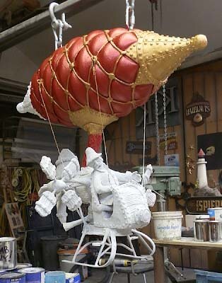
We assembled the nose cones with screws and PB Bond 240 - a one part glue ( formulated for HDU) from Coastal Enterprises. It is activated with a spritz of water and tends to expand some as it cures. As a result, we have to do a little cleanup and shaping with a die grinder before covering the nose cones with some sculpting epoxy (to add some detail).

The finished sculpt on the nose cones (as well as the hand crafted cables around the balloon) give the balloon a hand made look — matching the gondola underneath.

Once the epoxy sculpting medium had cured to was time to apply a coat of FSC-88 WB primer. This primer is heavy bodies water base primer from Coastal Enterprises. (We call it “marshmallow paint” in our shop.) We applied it by hand with a small brush to introduce a little more texture over the entire surface.

Once the primer had cured it was time to start in on some colour. As usual, we used acrylic paints. The metallics are from Modern Masters and look great - even on the first coat. Everything will get a second cot and before we start on the glazes to add depth and some aging.