Photoshop

G Street - Part 1

Jack Niemann's Black Forest Steakhouse needed a second sign for the handicap accessible entrance. Obviously, Jack wanted the sign for the “G Street” entrance be be done in the same style as the first sign. My father’s first step was to create the sign’s vectors in Illustrator - a vector program he is very comfortable with.

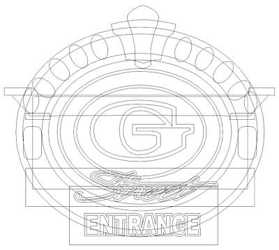
Then he imported the vector file into PhotoShop and quickly created this illustration with his digital pen and drawing pad to show Jack what he had in mind — he gave his instant approval.

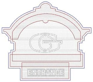
With Jack’s approval in hand dad imported the vectors into EnRoute and began the task of building the routing file.

He could have used the “sweep two rails” tool to build the crown moulding, but opted to build each element separately and then merge them together at the end for maximum flexibility. Since the vectors were separated into groups, he used the “jigsaw” tool to cut out the shapes and then merged them together.

Then dad used the “bevel relief” tool to create a relief twice as wide as he needed before he merged (merge highest) a zero height relief (of the correct shape) to it to create the final shape he needed.

The top and bottom flat portions of the crown were done in a similar fashion using the “jigsaw” tool.

Then he made the egg shaped reliefs and merged highest to the crown molding.

Once the balance of the reliefs were created, dad merged them together to form the sign. He duplicated and flipped one of the reliefs to make sure the two halves matched perfectly. before adding the G to each side as a beveled letter.

He divided the sign into six pieces to be routed from 2" thick 30 lbs. Precision Board HDU.

Here it is on the CNC table, being routed.

See you next week for Part 2 of the G Street sign series!

McIltrot Sign - Part 1

About a decade ago, Tom McIltrot, the editor of SignCraft, asked my father to make a small address sign for his parent’s home.

So, he whipped up a quick sketch in his ever-present sketchbook. As you can see, it was quite rough, but it captured enough information to get him started.

He imported that rough scribble into Photoshop along with one of our texture bitmaps, which he then warped to the appropriate shape. Once this was done, he drew a vector outline of the signboard.

Moving to Illustrator, he added in the vectors for the lettering and modified the name to match the curving sign bottom.

Normally dad wouldn't bother rendering a project this small, but this time he opted to fleshed out his sketch and sent it off for approval — happily, he got a reply in seconds. The senior Mrs. McIltrot checked it out and instantly approved it — if only dream more of our clients were that responsive!

With the stamp of approval in hand, dad created a relief in EnRoute using the dome relief tool. The dome shape was a slight 13 degrees. Then he plopped on the wood grain bitmap file and formed the gnarly grain. Since this was meant to be a piece of driftwood, he made it a substantial 0.4" deep.

Then he used the virtual sculpting tool to deepen the creases in specific areas as indicated by the red arrows. It didn't take long but the effect was quite dramatic.

The end view below shows how the virtual sculpting tool made these areas deeper, enhancing the wood grain.

Next he outlined the letters and formed flat reliefs. After this, dad drew an irregular curved shape and use this vector with the dome relief tool to modify the text reliefs to match the shape of the wood background.

In about twenty minutes the sign had gone from approved sketch to the finished routing file. (It took longer to warm up the CNC router!)

Once the router was warmed up, he started the file. And just like that, the sign started to come to life as the router automatically carved the Precision Board High Density Urethane.

Name Tag 017: Khai & Kirsten

Parametric textures are a great tool and can be used to good effect. However, many times the textures we want to create can only be done with bitmap textures. In the case of Khai's panel, we could easily have created a vector of the design. It is an oversize belt buckle sign background and, with the powerful tools in EnRoute, it could have been traced/vectorized to achieve the same effect as the bitmap we used. Nevertheless, this would have added one more step to the process, so we opted to apply the bitmap directly to the relief.

As for the extra texture on the background and lettering, it could easily have been done with a parametric texture. Once again, however we opted to use texture bitmaps. That is the beauty of a program like EnRoute — there are more ways than one, to skin the cat.

Kirsten's name plaque puts us solidly back into bitmap texture territory — the ‘leaf’ texture would be difficult to create any other way. Our first step was to create the vector outlines in EnRoute.

The bitmap texture, on the other hand, was created in Photoshop. The leaves were simply cut and pasted, adjusted for value, and rotated randomly. Once this was done, we applied it in EnRoute.

Every user has favorite methods they tend to use, given the choice. Happily, EnRoute is powerful enough to give us a variety of options. Our advice? Try them all — as you continually push the boundaries you will find occasion to use them all.