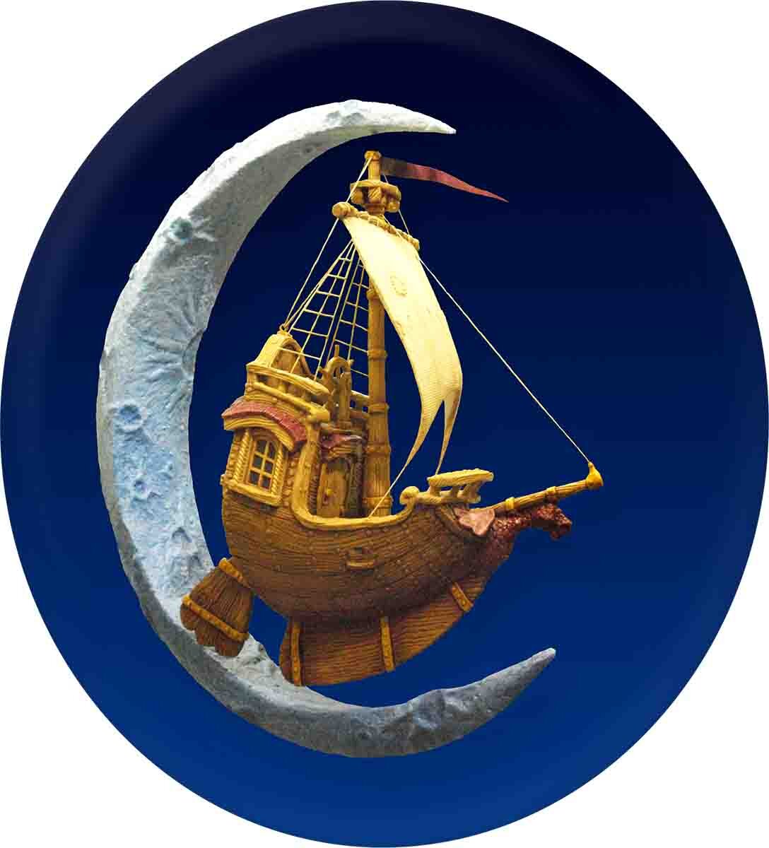
This particular piece was a promotional display. As usual, it started its life as a concept sketch.
Once the design had been settled, it was time to design the vectors. The challenge on this project was to curve the sides of the box inward while also splaying out the top edge. With EnRoute there are a number of ways this can be accomplished. For instance, we could use the “sweep two rails” function. However, we opted to use our favourite technique — applying bitmaps.
Once the vectors had been created, we made a bitmap — a blend which faded from white to black to white again.
When applying bitmaps it is important to remember that white is the “active shade” — applying a pure black bitmap will not change the relief in any way. Grays are more of less “active” depending on their value — the closer to white they are the bigger the change the will make.
We applied this bitmap to the relief to raise the boards and the lettering in separate passes, keeping the numeric values the same so their curves matched.
Then we took a cartoon woodgrain bitmap from our Texture Magic: Classic Collection and applied that to the boards. The end result looked something like this.
We positioned the letters on the boards and merged them together with a flat background. Note that we kept the boards slightly oversized so we could trim them on the table saw to get the corners cut at a forty five degree angle.
The picture below shows just how much curve we managed to achieve using the bitmap.


