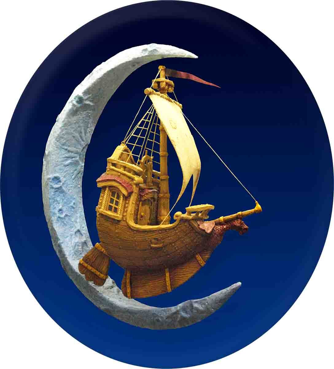
This little project proved to be both challenging and fun. The logo’s original design was done by Curtis Cottrell and it looked great in print. Our challenge was to re-create it in three dimensions. With the extreme angle of perspective the key to this piece was to limit the angle of viewing. We did this by making a shadow box to display the piece.
However, before the piece was ready for display it needed to be painted. Our client had asked us to “make it real” while also respecting the limited colour palette they had used on the original logo. The painted the scene in stages from front to back. Once we get to the front it will be very difficult to access the back since foreground trees will be permanently fixed in place.
It is amazing how each added piece changes the look in such a profound manner. It was important to keep the pieces handy to check how it would look when it was done.
The last step was to add a couple washes of brown to the foreground trees. Then we sent it off to the cabinet makers to have a lectern built around it.


