Black Forest - Part 2

black-forest-concept-drawing.jpg

Now that you have had some time to think about how you might approach the Black Forest sign, lets take a look at how we tackled this project. Our first step was to create the vectors for the type. We did this work in Illustrator — although we could have done it in EnRoute. Once we were satisfied with the type, we imported it into EnRoute.

black-forest-vectors-1.jpg

Then we started with the box shape for the bottom of the sign and the oval where the knight will sit. We whipped out these shapes by eye; the two outermost rings will form the cornice molding on top and the two horizontal rectangles will also form part of the cornice.

We duplicated the rings and horizontal lines that form each shape, leaving a copy in place to re-register the new shapes we will create (again, by eye).

black forest vectors 2.jpg

Then, using the jigsaw puzzle tool I simply clicked in each overlapping section , deleted the original vectors and merged them to form one shape.

black-forest-vectors-3.jpg
black-forest-vectors-4.jpg

We brought hese shapes back into position over the original vectors and. once we were happy with their placement, we deleted the original lines.

After this, we created a few more lines and shapes which we will use to create the reliefs inner next instalment. In the meantime, study them closely to see if you can figure out how we are going to use the “add to” and “subtract from” tools as well as “merge highest” and “merge lowest” to create this seemingly complex routing file.

black-forest-vectors-5.jpg

The process won’t be that difficult — just a series of simple steps, done in a logical order. It's going to be fun and it shouldn't take more than 20-30 minutes to finish the reliefs before applying the tool paths.
Black Forest - Part 1

black forest window.jpg

The next project we will look at is the sign is for an upscale restaurant in a beautiful new brick building that built to look a hundred years old.

The sign’s shape and details were inspired by the building’s cast iron windows, which were imported from a building salvaged in Paris.

The knight, featured on the sign also duplicated (in miniature) a larger piece inside the restaurant.

Finally, the sign’s bracket was hand forged in our shop. It reflects the style of the restaurant’s interior trim.

black forest concept art.jpg

This double sided sign was routed from 30 lb. Precision Board HDU and measured 4' wide x 5' tall x 12" deep.

We will look back on the sign’s construction in our next instalment, but in meantime take a close look at the concept and think about how you would tackle this project if it came to your shop.

Sonbuilt Logo - Part 5

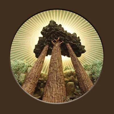
This little project proved to be both challenging and fun. The logo’s original design was done by Curtis Cottrell and it looked great in print. Our challenge was to re-create it in three dimensions. With the extreme angle of perspective the key to this piece was to limit the angle of viewing. We did this by making a shadow box to display the piece.

However, before the piece was ready for display it needed to be painted. Our client had asked us to “make it real” while also respecting the limited colour palette they had used on the original logo. The painted the scene in stages from front to back. Once we get to the front it will be very difficult to access the back since foreground trees will be permanently fixed in place.

painted 2.jpg

It is amazing how each added piece changes the look in such a profound manner. It was important to keep the pieces handy to check how it would look when it was done.

sonbuilt-painted 3.jpg

The last step was to add a couple washes of brown to the foreground trees. Then we sent it off to the cabinet makers to have a lectern built around it.

sonbuilt-finished sculpture.jpg