Dirigible Model - Part 2

In preparation for testing out our (at the time) new four axis CNC router, we cut and glued up a variety of 30 lbs. Precision Board HDU blocks. The pipes sticking out of the ends of the blocks are for chucking them up in the machine.

The bottom large block in the picture below was for the ballon section of the dirigible project. It measured fourteen inches square by twenty inches long.

However, before routed the ballon we welded up the steel frame for the airship’s “pilot’s basket”.

Once the welding was complete, we started sculpting the basket, using sculpting epoxy.

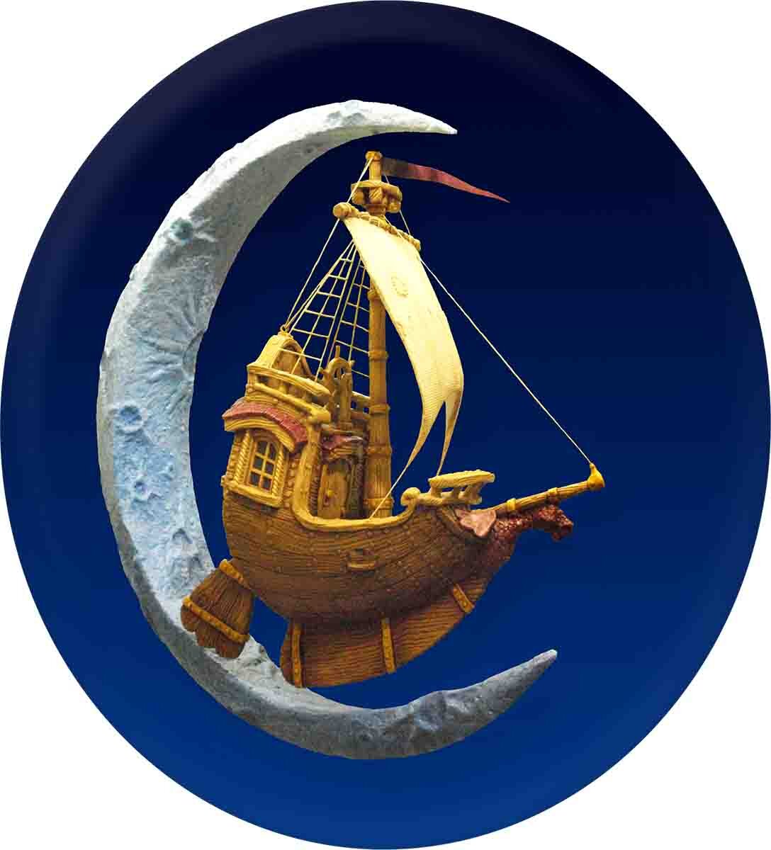
And, of course, we did a quick comp/sketch of the balloon to help visualize the finished project.
Dirigible Model - Part 1

“Blue sky design” is a term used to describe ideas and concepts that are brand new — still very much in the exploratory stage. Anything is possible at this early point in the design. It’s a fun period for any project.

Many years ago, when we first purchased our four-axis CNC router, we knew there would be a bit of a learning curve. Our plan was to build some samples — we certainly weren't going to schedule a customer's work until we were comfortable with the machine. We hoped (and it turned out to be the case) that this would allow us to go further, faster, than going straight into production.

We decided to build an airship for the router’s first project. Believe it or not, our family has a long history of building dirigibles. More than twenty years before this, Dan had built a model airship using a brand new lathe (fittingly, I think it might have been the first project to come off that particular machine as well.

A decade or so later, that early model had inspired a large-as-life version for Professor WEM's Adventure Golf at West Edmonton Mall. This larger dirigible was constructed of sculpted concrete over a welded steel frame. (Which made it the heaviest lighter-than-air craft ever assembled!)

In the early 2000’s we were seriously considering expanding Giggle Ridge (an adventure golf we had build/owned/operated) and, as part of that plan, we designed a railroad which circled a small mountain. (Our house and studio would have been hidden inside the mountain.) On the ‘show side’ of the mountain, a hot air balloon would have been tethered in a hanger. Dan built a quick study model as part of the design process, but the project changed direction before it was finished.

The drawings for that particular project were the inspiration for this next (CNC routed) iteration of our ‘blue sky’ airship.

Queens' Signs

As a rule, we don’t build 3D files for other shops. And we are rarely called upon to build other people’s designs. However, these particular pub signs were and exception to both rules.

The designs were complex, but since we were promised complete vectors it seemed like a fairly straightforward job.

Unfortunately, when Dan first opened the vectors he discovered the centre of his screen was literally black with lines. It took him a couple of tries to find the source of the problem. As it turned out, EnRoute was importing the gradients as an endless series of closely spaced vector lines — the file was far too complex! The solution was to open the files in Illustrator and delete all of the fills and blends.Once they had been cleaned up, the files imported flawlessly.

However, many of the vectors in the file were still usable. The letters were too thin, some outlines were missing, and many components were broken up into small pieces.

It took a lot of careful planning to determine how he would shape and layer each piece to build the final 3D sign.

In the end, while the illustrations looked fabulous, on closer inspection they simply wouldn't work (as drawn) in the 3D world. So they needed to be cleaned up before he started creating reliefs.

The lesson? It is better to start a design with half an eye on how the sign will be built!

These three signs were to be double sided (each side routed from 2” thick HDU) so Dan started with a half inch thick relief.

Next, Dan added a 0.2" double border. This was done by adding to the relief.

From here on in things got a little more complex. Each layer was created as a separate relief, floated into final position as necessary and then merged to the base relief. The outline of the interior ‘fancy’ border was created next as a raised panel, above the border lines.

Next, Dan formed the scrollwork. Each layer of the scroll’s folds was created as a separate relief at the appropriate height, then combined together, and lastly merged with the base relief.

The top scroll and the filigree was next, done layer by layer and then merged with the bottom layer.

For the crown at the top of the sign, Dan decided he wanted a little more dimension. He formed a flat relief and then modified it with an oval. This rounded the crown out dramatically. Then he moved to the side view to bring it up above the top banner. To keep things simple, as he built the file, Dan deleted the vectors and redundant reliefs after they had each been merged.

The ‘Queens’ outline and prismatic lettering itself was next on the agenda.

After that, the home town lettering and border was floated up above everything else before being merged with the base relief.

The bar oval was as much work as the rest of the sign all by itself. To be usable as a routing file, the woven ribbon vectors had to be recreated from scratch — a lot of work but well worth the effort. The other elements were built as separate reliefs and combined to form the bar button.

Dan floated this to the same overall height as the tallest lettering and merged it to the base relief. And, just like that the file was ready for tool pathing!

Happily, since he had blazed the difficult trail on the first sign, Dan found it easier to follow on with the next two signs!