Rope Panel

EnRoute is capable of so many cool things. This week we will take a look at a feature we call the ‘Rope Trick.’ It is a quick way to create a rope border around a panel.

First you need to create four circles. The scale of the circles does not matter at this point. Then you can line them up by eyeball as shown below. You could use the align tools,’ but this isn't rocket science - it's just a rope.

Now select all four circles and combine the vectors using the ‘weld tool’ to form this shape which looks like the cross section of a four stranded rope.

Next, define your plate we used a 8" x 8" x 1.5" deep plate.

Draw a circle and then use the ‘offset closed contours tool’ to create two inner rings - all spaced 0.5" apart.

Then scale the rope contour to suit the big rings. The rope will be centred on the middle circle.

Next you will create a more ‘mesh. ’ To create the rope mesh, click on the ‘revolve to create surface’ button. Then, from the drop down menu, select the ‘extrude contours’ menu. Choose the ‘mesh function’ which looks like a globe.

Increase the slices and stacks from 12 to 100. Then, set the number of rotations the rope will make as it goes around the circle. Based on our experience, 7 rotations looks good on a circle this size. But you may want to try a few different numbers to see what happens.

Select contours to be extruded (the cross section of the rope). A blue arrow will light up... click it. The prompt will ask you to select the path to follow. This is the center vector circle. Hit the check mark and PRESTO - a rope appears!

Keep in mind that this is a mesh. Meshes cannot be tool pathed until they are made to be part of the reliefs!

(As an aside you will note a third ring in the screenshot below — take a minute to create this ring as well, you will need it later.)

You need a relief to combine the mesh with... so select the inside and outside circle vectors and using the ‘dome tool’ create a donut shaped relief.

In the front or side view move the rope mesh up into position using the up/down keys. Then, select the relief and the rope mesh and opened the ‘add mesh to relief menu.’ It looks like a pyramid (from the top) and will only light when both a relief and mesh are selected. In that menu, select the ‘merge highest’ and ‘smoothing’ (set at medium) commands and hit apply.

It doesn't look like anything happened until you select the mesh alone and delete it. But now the rope is part of the relief.

Now it’s time to use the third circle vector you created earlier. Select it to create the centre dome relief. Make it a 0.3' high base and a 17 degree dome.

Then import a bitmap to add texture to the dome. We used a texture bitmap from our Texture Magic: Classic Collection. Size it to fit the circle, being careful to centre the pattern. Then, select both and use the ‘create bitmap tool’ with a 0.2" height.

Now type the letter 'A' and size and centre it on the dome. Using this vector, create an outline of 0.2" around it. Then, created a flat relief with a height of 0.5" using the letter outline. Now, using the rope centreline vector, modify the relief with the ‘dome relief tool’ set to 17 degrees (to match the angle you used to create the centre dome.

Check the result (you may need to nudge the ‘A’ slightly upward). Next, merge it to the centre dome background using the ‘merge relief tool.’ (Make sure you select the ‘merge highest’ command.)

Everything looks pretty good at this point, but it is a bunch of separate reliefs still. We need to merge everything into a single relief.

Create a zero height relief that is a little bigger than the overall size of the piece. Then opened the ‘merge relief tool’ (it looks like two mountains pushed together), select the base relief and follow the prompts to select the reliefs that need to be merged.

Make sure you ‘merge highest’ or weird things will happen!

Once everything is merged, delete all but the base relief and the letter 'A' vector. Then, select the relief and the 'A' vector and use the ‘add to relief command’ and the ‘bevel relief tool’ to create a beveled 'A'. Give the letter a base of 0.1" (This means the side of the 'A' (before the bevel) is 0.1" tall.)

Now the file is ready to send tool path and send to the router. See you next week!

Woodgrain Panel

This week we will start with a relatively simple file in EnRoute... a wood grained panel with a raised border and a beveled letter with a second bitmap on it. Here we go...
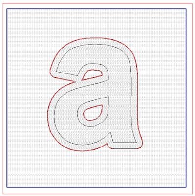
First create a 6" x 6" x 1" thick plate. This represents the size of material you will route your final piece from. Inside this plate, create vectors of a box and the small letter 'a'. Then create an outline around the 'a' with a value of 0.2". This can all be done in EnRoute using the draw tools. (You could also create it in Illustrator or any other vector drawing program. However, if you do it outside of EnRoute you will need to import it as an AI file.)

Then select the outside vector square and create a base relief. You can do this with the ‘create relief tool’ that button looks like a loaf of bread. Make your relief 0.4" thick.

Then you can import a woodgrain bitmap. The one we used is the sandblasted woodgrain from our Texture Magic: Classic Collection. By default, when EnRoute opens the bitmaps they are as big as the plate. In this case, it will be far too small to be able to route decent woodgrain with a 1/8" bit. (The smallest bit we typically use.) So, you will need to be enlarge the bitmap significantly. The sandblasted woodgrain texture we used is a 8.5" x 11" 300 DPI file and we could scale it to create believable woodgrain on a 48" x 96" sheet of material without any difficulty.

So, select the woodgrain bitmap all by itself and, by grabbing the corner nodes, stretch it out until the square vectors are inside one of the individual boards.

Up close it should look something like this...

After selecting both the relief and the bitmap, you can select the ‘apply bitmap’ menu. (It looks like a mountain and sky.) Apply a value of 0.2" in the table, choose ‘add to relief,’ and hit enter. This means the black areas of the bitmap did nothing. The white raised 0.2" and the grays (depending on their value) did something in between. Just like magic the wood grain appears when you hit the render button (lightbulb).

Next, delete the wood grain bitmap — you won't need it any more. Then, render the file one last time to check things. The relief should look like this now.

Now it gets a teeny bit more complicated… The secret is to do things in the right order! Select the border of the letter. Open the ‘create relief’ menu and then the ‘add relief box.’ Then type in a value of 0.7." Create this as a ‘flat relief.’

The reason for the value of 0.7” is as follows: The original relief was 0.4" and we added 0.2" for the woodgrain... so if we add another 0.1" for this border we get 0.7”. (This ensures the letter sticks above the board.)

Everything looks great at this point, but you have two different surfaces in the same space and if you were to tool path and route the file as it is now, some funny things would happen! So, deselect everything, then open the ‘merge menu.’ This button looks like two mountains being pushed together. Select ‘merge highest’ — the base relief (outside square) it will turn blue. (The red box is your plate and will not affect anything.)

Next, press the ‘arrow button.’ Then select the second relief (in this case it is the letter outline) — It will turn red. Then press the ‘green check mark.’

The ‘a’ is now merged with the woodgrain board, but you are not quite done. You must delete the outline of the letter. Then check the render — If you did it right the background relief will now have the letter outline merged to it.

Now you are going to add to this relief. Select the base relief and the remaining (inner) letter 'a' vector. Open the ‘create relief menu’ (it looks like a loaf of bread) and select the ‘bevel tool,’ and ‘add to relief.’ Input in a value of 0.1" for the base. This means the sides of the letter will be 0.1" tall before they start to form a bevel. Input in a value of 21 degrees for the slope of the bevel. Use a ‘fixed height’ of 0.15." Lastly, hit the enter key.

When you hit the ‘lightbulb (render) button’ it should look like this. You could stop here and it will look great but we are going add a little texture to the letter.

To add a subtle texture you can importing another bitmap from our Texture Magic: Classic Collection (the texture is called splotches).

As you did with the woodgrain texture, enlarge it before selecting the base relief, the letter vector and the bitmap. Once the ‘texture button’ is lit up, you can open the menu and add the texture to the relief. This time enter a value of 0.1" (This will make for a much subtler texture.)

Once again, delete the bitmap and the letter 'a' vector. You will not need them anymore. Check one last time with a render (lightbulb button).

Now you have to make sure it fits within your plate vertically before you tool path and route it.

Our advice is to build a half dozen of these type of basic files in order to get yourself familiar with working in EnRoute. You can route them and paint them up too — it’s all good practice!

When we started, we created all the letters of the alphabet — each styled differently and with a variety of textures. After twenty six different files, we had this process down to a science. We also had twenty six marvellous samples hanging on our wall that still serve us well.

See you next week!

McIltrot Sign - Part 2

The McIltrot sign features a small bird sculpture. My father used sculpting epoxy to form the bird before applying the feathers one at a time.

With the sculpting finished it was time to paint.

We regularly get inquiries regarding our painting process. As a result, it is one of the things we spend a fair amount of time on in our workshops.

Our method uses water based acrylic paint. Once upon a time, we used a brand of paint called General Paint and we currently use Sherwin Williams. Whatever brand you use, we recommend using one of its higher quality lines. We generally use semi-gloss, satin, or low-luster finish. High gloss tends to give a plastic use, and flat paint isn’t quite as nice to work with.

We often use Coastal Enterprises water based ‘marshmallow’ primer to add additional texture to our signs. It is a high build, sand-able primer — we apply it with a brush but we do not sand it — brush marks are our friend! It is important to place the primed work under fan for at least three hours immediately before applying your first coat of paint — this draws out the moisture. This is vital if you want the paint to last!

Once the primer has cured we put on two coats of base colour, drying well between coats. Our base coats cover everything.

Then it is finally time to start laying on a series of glazes to enhance the texture we’ve created.

We mix our glazes ourselves using a simple formula. First we buy the clear base (some brands refer to it as ‘ultradeep base’) but without any colourant added. It looks milky white in the can but drys clear (or nearly clear).

The folks at the paint store will look at you funny when you ask for it — after all, why would you want un-coloured paint?

Our basic glaze recipe is to mix a ratio of 50% clear base with 50% paint of the colour of your choice. This will look coloured in the can but will dry to semi-transparent glaze.

We generally apply a series of two to four glazes. The first glaze is very lightly coloured, just a few shades off of the base colour. The lightest color glaze is brushed on liberally then gently wiped off with a towel. With each coat of glaze we will wipe more and more off, leaving the colours underneath show through.

Dad used some of that same glaze to add colour to the bird's beak. Then the sign is put back under the fan to harden up.

The next colour of glaze is a little darker — in this case a reddish brown. It was flowed on and then wiped off with a towel. Dad took a little more off this time, allowing the colours underneath to show through.

After this, Dad added colour to the bird and the worm. Then the sign goes back under the shop fan once more.

Once the sign has had a chance to harden up, Dad brushed a final dark glaze over the entire piece (including the bird and worm). He left a little more glaze around the lettering to help it read.

Typically we raise our lettering at least a 1/8". This makes it easy to paint the tops by dragging the brush along the edge.

Once the letters were triple coated Dad added the dark pupils to the eyes (and a tiny white highlight to make them come alive).

And just like that, this little sign was done!