If you haven’t guessed by now; Dan loves texture. One of his favourite things to do is to mimic the look of an old piece of weathered driftwood.
To start this piece, Dan typed the letters into EnRoute. But as per usual, the lettering needed a little tweaking to make it work. He kerned (adjusted the spacing between the letters) it a little. And, he also reduced the size of the 'A' just a little and bumped it up between the other letters.
Then he decided he wanted the long cross bar of the 'A' to line up with the fancy jogs in the ‘J.’ He used the point editing tool to fix that up a little and then it was time to get down to business.
I imported the driftwood bitmap (from our Texture Magic: Classic Collection. The starting point for this bitmap was a real piece of driftwood, but it has been heavily tweaked to make it work as a texture foundation. After importing the file, he used the vector drawing tool to trace a shape for the board outline.
He also created a vector offset border around the letters and an oval vector which will be used to dome the letters to the shape of the sign.
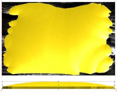
Next, he used the dome relief tool with a shallow angle to create a shape. With all the jagged edges it's a little humpy and bumpy. But, for driftwood that will only add to the charm.
He applied the bitmap at .3" This is a lit of texture depth but driftwood needs to be knarly. The end result looks pretty good but compared to a real piece of driftwood it is a bit even and flat. However, EnRoute has a tool to fix that in a hurry.
The dome edit relief tool is used like a virtual carving tool. The parameters can be adjusted so the tool feathers as you adjust the pen pressure. With a few quickly applied strokes in the area of the arrows on the photo Dan carved away a layer of 'wood without diminishing the bitmap grain. The end results adds a lot of dramatic effect with little effort.
Then he created a flat relief with the lettering border and modified it with the dome tool and the oval vector line to mimic the top curve of the driftwood relief. This was bumped to position vertically with the up/down keys in the front view of the screen. Once he was happy, Dan merged everything into one relief.
Then Dan added the lettering, adding to the relief with the bevel shape. It was looking pretty spiffy but needed a little something extra.
He decided to add some large spike heads, top and bottom. He created two irregular circles with the vector drawing tool. When he applied a bevel they instantly looked hand forged on account of the facets.
He liked the effect, but decided they needed to be sloped slightly to match the tapered wood. Using the same oval he had used on the lettering, Dan modified the two reliefs using the dome tool.
Jay's name plaque was now ready to tool-path and route!
Fresh off the router it looks pretty good.


