Visiting with the good folks at the Fox and Hounds Pub was a pleasure as always. It was good to catch up on things. Their two boys had carved their initials into one of the trees when we first built our features. Now, ten years later the tree was still in perfect shape. The two young boys I met back then were grown up and both were (much) taller than me. I spent much of the morning up in the man lift, cleaning and repainting the reds and blues on the entrance sign. The rest of the sign was in perfect shape. It was a bit like meeting with an old friend. I remembered to grab a great picture of the sign before I lowered myself to the ground this time around. All of the pictures I had on file from when we did the project were from the ground.
Like new (again)
Ten years ago we designed and worked on the Fox and Hounds Pub and Restaurant, helping to transform it into a fully themed establishment. Countless guests have enjoyed the ambiance since. Recently, the owners have begun a repaint of the exterior (see how faded the yellow exterior paint had become below). We were called to spruce up the signs and touch up the interior theme work where needed as well. Today, I donned my safety harness and climbed into the man basket of the lift to do the sign. It was in remarkably good shape considering it was on the south wall and out in the weather for the last ten years.The fox and banner were still totally presentable and only the British flag background and bottom blue banner needed repainting. Two quick coats of paint made them look as new once more. Tomorrow I’ll do the front entrance sign on the other side of the building. Inside most of our work is still just fine, with the exception of some bumps and scrapes on the trim and door jambs. I patched a couple of small holes in the drywall and Becke is doing the touchups, skillfully blending the new paint into the old where necessary. In less than four days we will make our work look like it did ten years ago when it was new. That is a testament to the quality of the work we did back then as well of the loving care the owners continually lavish on this fine establishment.
HEAR YE, HEAR YE!
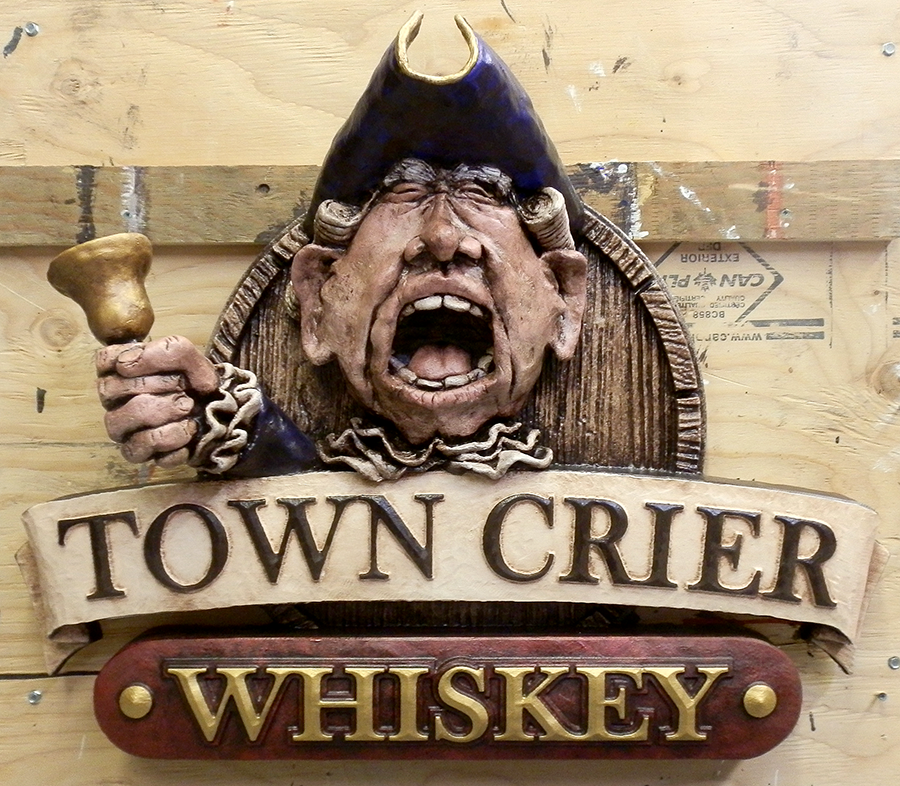
We designed about six fictitious liquor brands for the Fox and Hounds Pub. These designs were then made into dimensional signs which hang throughout the establishment. One of them was the Town Crier Whiskey sign. The character has a slight resemblance to Prince Charles which wasn’t intentional. This sign was so much fun I made two copies. The owner was given a choice of her favourite and the other hangs in our shop display.


