
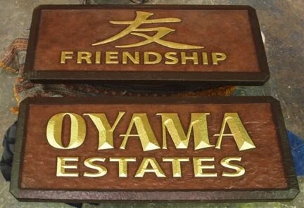
I often tell people that square or rectangular is the way we get our materials - not the way our signs go out the door. But every once in a while, to fit into the overall scheme of things, a sign needs to be just that plain and simple shape.
The signs for Oyama Estates will be mounted on a much larger entrance feature. We sculpted massive, jagged rocks on each side of the road, complete with a bonsai tree perched on top. Since we are seeking to create a place of tranquility the last thing we needed was busy signs attached to the fronts. Instead I opted for a simple rectangular shape. It’s elegant and restful. 23K gold leafed bevelled lettering adds elegance. Everything is subtly textured to give it a hand-hewn feel. The colors are earthy and muted. A plain, bevelled border frames the understated signs to separate them from the rock work.
Signs of the same shape will carry the simple, tranquil theme through the development. It’s a radical departure from the bulk of our colorful work and a delightful change for us too. After we complete the dozens of signs for this project I’ll be more than ready for the fancy shapes we most often do.
-grampa dan