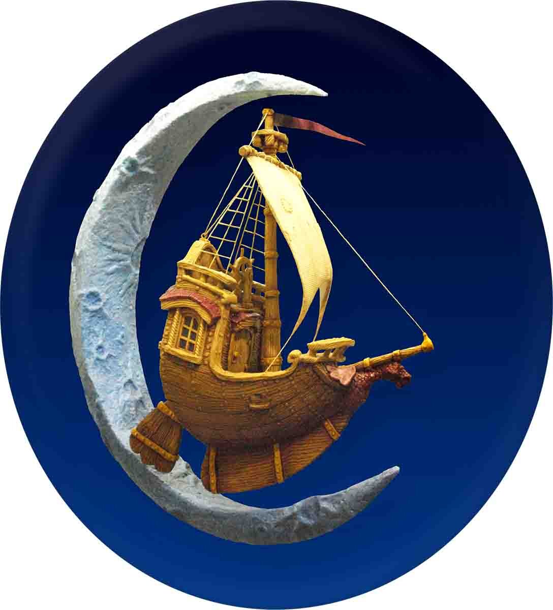
There is an unwritten rule that logos should be simple and easy to read. These days many companies go for a single letter or even just a simple shape but we feel such a symbol couldn't possibly convey what our company is all about. So we break that rule with a vengeance. Our logo is a fully dimensional ship sailing through a crescent moon. It clearly says we are all about telling stories and magic and do it in three dimensional art. We needed a good sized version of our logo for the new trade show booth. I had made a sign a number of years ago which had 3/4 of the ship mounted to an oval background. The crescent moon was there too but it was blended into the background. I pried the ship off the sign and welded it into a new moon armature. Jenessa sculpted the missing bits of the ship and the new moon. She also laid on the base colours. To blend the new bits into the old ship we are calling in our expert painter Hailey. She'll make it seamless. She'll also bring Juniper to the shop while she works... which means I'll get to spend some extra time with our newest crew member.

